Humans of New York
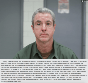
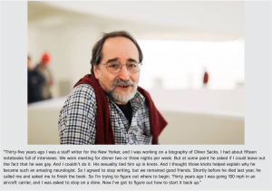
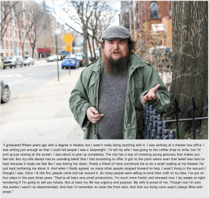
When it comes to photographing strangers, this project has become one of the most talked about and most influential. Humans of New York is all about the photographer capturing the personality and story of the subject. There is something so breathtakingly human about this project. In that I mean that looking through the images captured and put on this blog is the sort of thing that makes you really appreciate how complex, diverse and fascinating humanity is as a whole. Its so easy for everyone to just blend in to a large faceless mass. But Humans of New York pull those individual faces into focus and show us that everyone is someone.
Steve McCurry
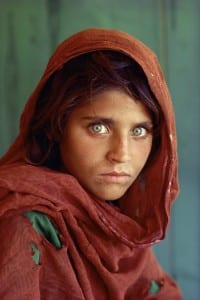
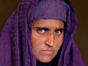
When researching portrait photographers, the first name that always comes up is Steve McCurry. He famous for his 1984 picture ‘Afghan girl’ which appeared in National Geografic.
I really like this photo. The colours in it are amazingly vibrant. Theres something about the way the girl look straight into the camera, almost challengingly in its intensity. Once again talking about the colours, something I find really interesting in this photo is the fact that there are only a few recurring colours and there is a definite theme in them. The background colour is remarkably similar to the green cloth of her under shirt and her eyes. The red of her scarf is complimented by the warm hue of her skin and hair. Shades of red and green are the only two colours really present in this photo, and yet it still comes across as vibrant and full of life.
McCurry’s other photos are similar in the way he uses colour. Normally by having one eye popping colour and all the other colours in the photo being of a similar shade. This is something that I incorporated in to my self portrait. Because I was wearing a bright blue hat, I tried to make sure my background was a grey shade as this would match my hoodie and bring the hat into greater focus.
Jill Greenberg
When researching photographers, I came across a photo that was so different from everything else I had seen so far, that I immediately loved it. The photography done by Jill Greenberg is amazing to look at. It looks so unreal and artificial, its just fascinating.
Greenberg uses studio lighting to achieve this effect. In my opinion, it almost make it look like the subject is made out of plastic. Another word I could use to describe it would be hyper realistic. Greenberg also says that she uses photoshop, just to take her photos that edge further, although most of the effect is achieved with a mastery in backlighting.
Experimentation
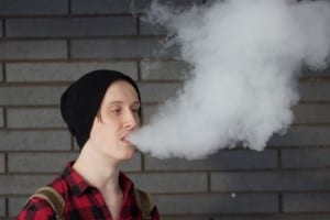
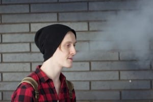
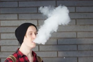
When experimenting with portrait photography, I tried to creating something that wasn’t just a candid photo; something that someone could have taken with an iPhone on a whim. To be honest, I wasn’t sure exactly how to achieve this, as I had never taken a portrait photograph before that wasn’t for personal enjoyment. I started to think about how I could use the environment in my photos, and how I could incorporate outside things to make my photos more interesting. This lead to the smoke pictures. I thought it would look really nice if I could get a photo of my subject somewhat obscured by smoke. Unfortunately the pictures didn’t turn out how I wanted them to. They are not in focus for one, also I didn’t achieve the effect that I was hoping for. Another thing I tried was using glass to reflect the subjects face. This would create a sort of duality within the picture. Once again the photo didn’t quite have the effect I was hoping for, and I decided that I wasn’t yet skilled enough to try and get the sort of image I wanted and do it well enough to be satisfied.
The last image however I am more happy with, as with this one I set out to have a really narrow depth of field, which is exactly what I got. The subject really stands apart from the background and I really like this effect and will probably use it in my final pictures.
